top of page
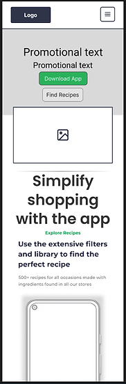
Responsive web design
This project required me to develop a responsive web app that could be used to advertise the ShopSmart app. I successfully designed and implemented a fully responsive web page that could be used across several screen sizes.
Auto-Layout
By utilising containers and auto layout features, I was able to create elements that replicated the behavior of flex-grids in web programming. This allowed the design to automatically adjust to different screen sizes, ensuring a seamless user experience.

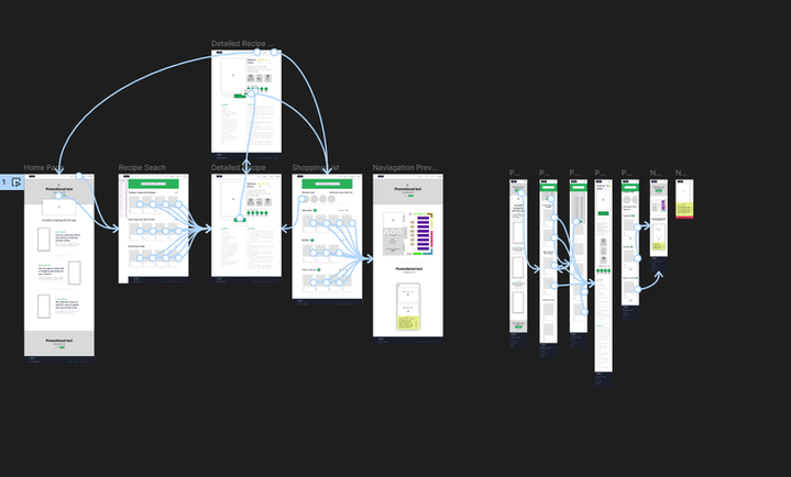
Lo-fidelity Prototype
A low-fidelity prototype was developed for 2 common screen sizes (desktop & mobile). This helped identify usability issues related to navigation on smaller screens, leading to design improvements. This ensured the same experience for users across screen sizes.
bottom of page